For those curious, here’s my first stab at a graphic redesign of my Writer’s Manifesto. I used Canva, an excellent and intuitive graphic design site; I found their tutorials really useful.
In order to get a sense of scale and space, I decided to go with just the major bullet points of my initial manifesto, and eliminate the explanatory text. I also trimmed one of my points because it was too wordy. This was helpful: I really got a sense for how many words my original piece had in it!
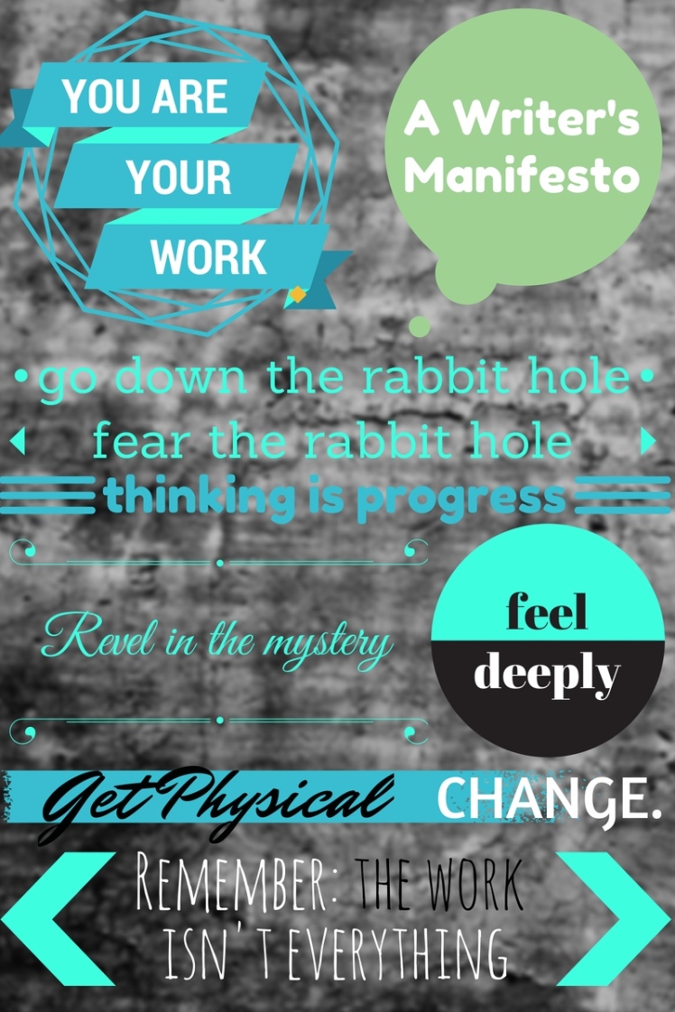
Overall, I feel pretty proud of myself for coming this far. I think this version is a little crowded: too many shapes, perhaps too many different fonts. I’m happy with the color scheme, though, and think I have about the right number of colors. I might take what I’ve learned from this one and try an illustrated version where each numbered piece of advice is given a visual representation. We’ll see…
